Panels where you need them: a docked layout in the browser
The browser version of Debrief, the playground and the web demo, had grown thirteen panels in one column beside the map, and analysts scrolled up and down to find them. Now, on any screen 900 pixels wide or more, the panels sit in tab groups around the map, grouped by task, and you can drag them where you want them.
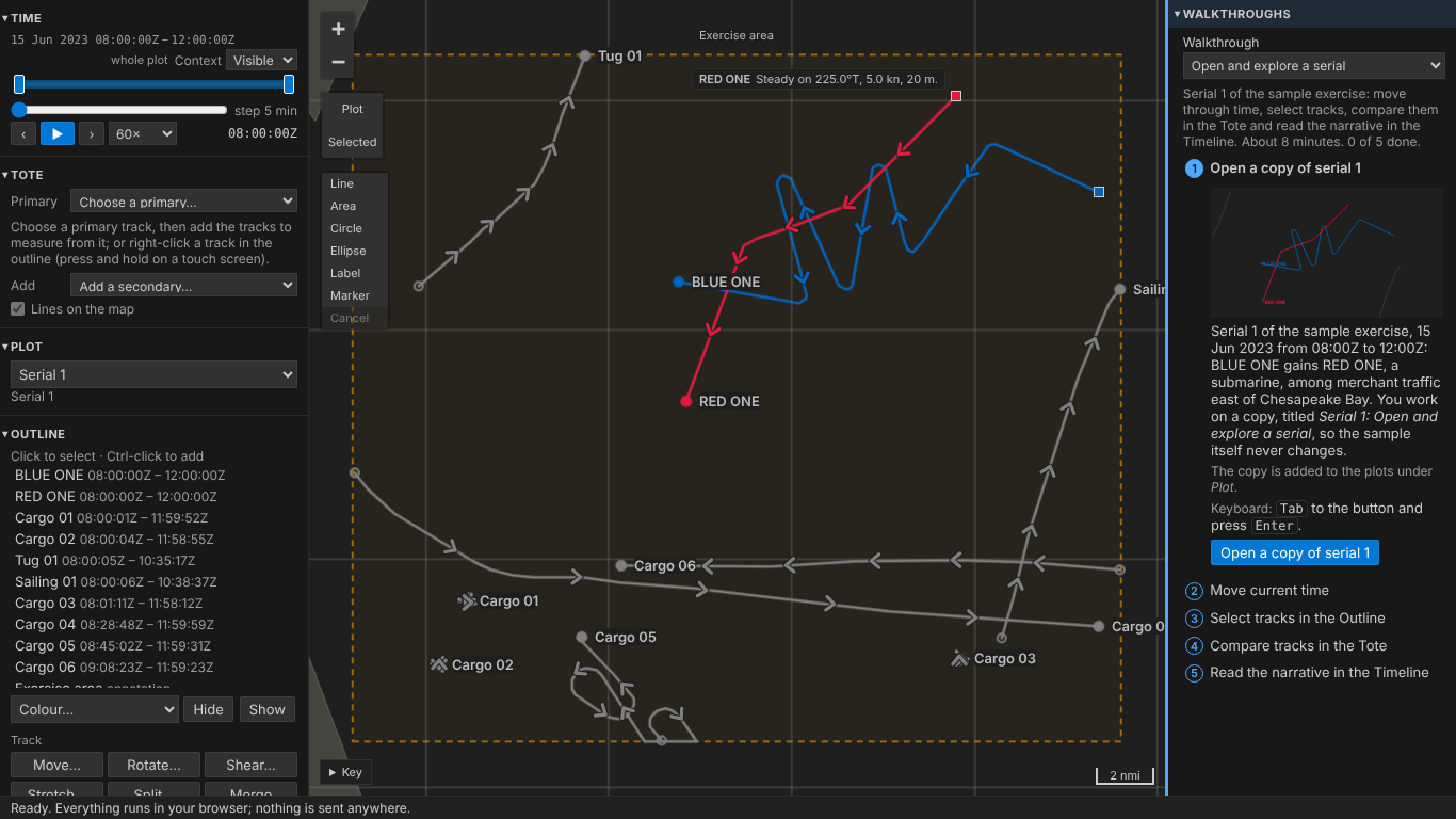
The pictures are taken by the playground's test on the sample exercise, which is made up; the first is the layout before the change, from its pull request.
Before and after
Before, at a laptop's 1366 pixels: one long column of panels on the left, the walkthroughs in a column of their own on the right.
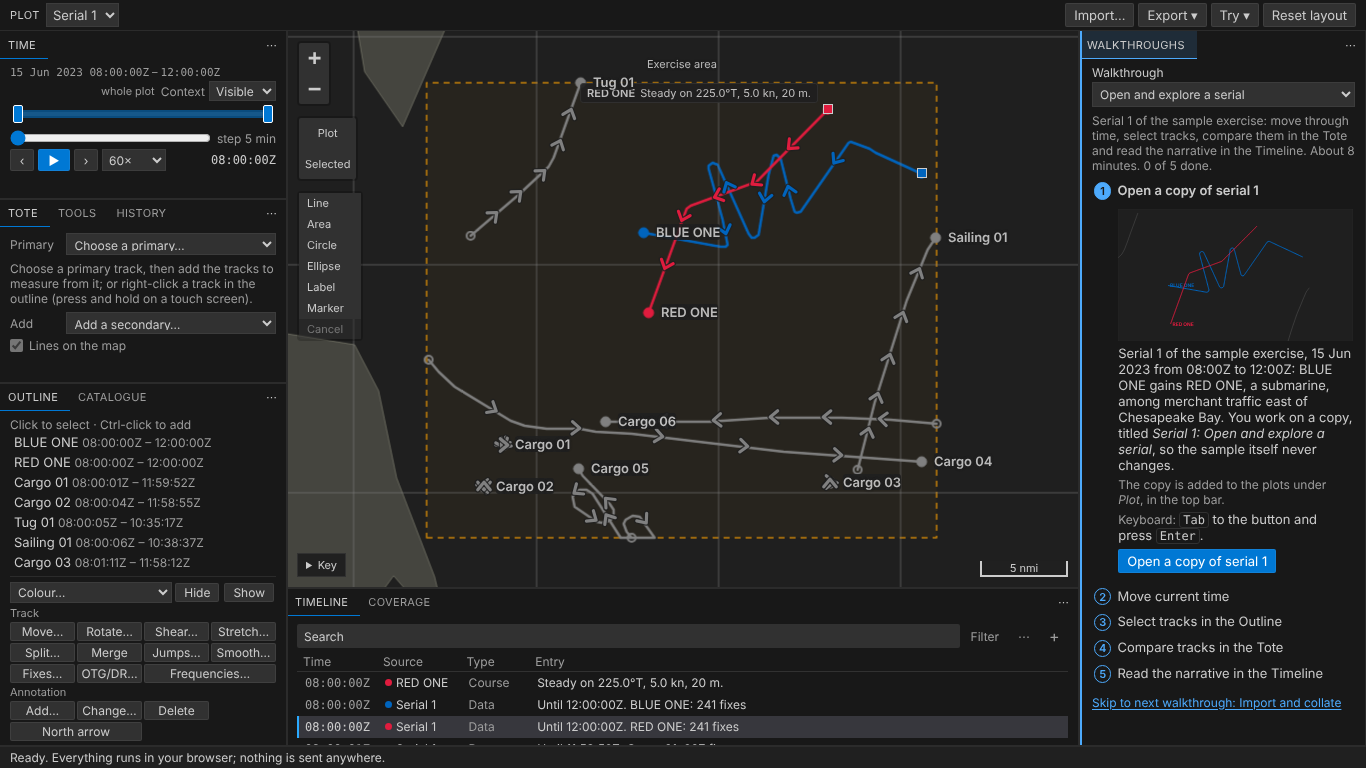
After, the same screen: Time, the Tote with Tools and History as tabs beside it, and the Outline with the Catalogue on the left; the map with the Timeline and Coverage in a strip under it; the walkthroughs alone on the right, so a step's words are never hidden behind another tab. Nothing scrolls the page, and the map is 791 by 556 pixels, more than half the width.
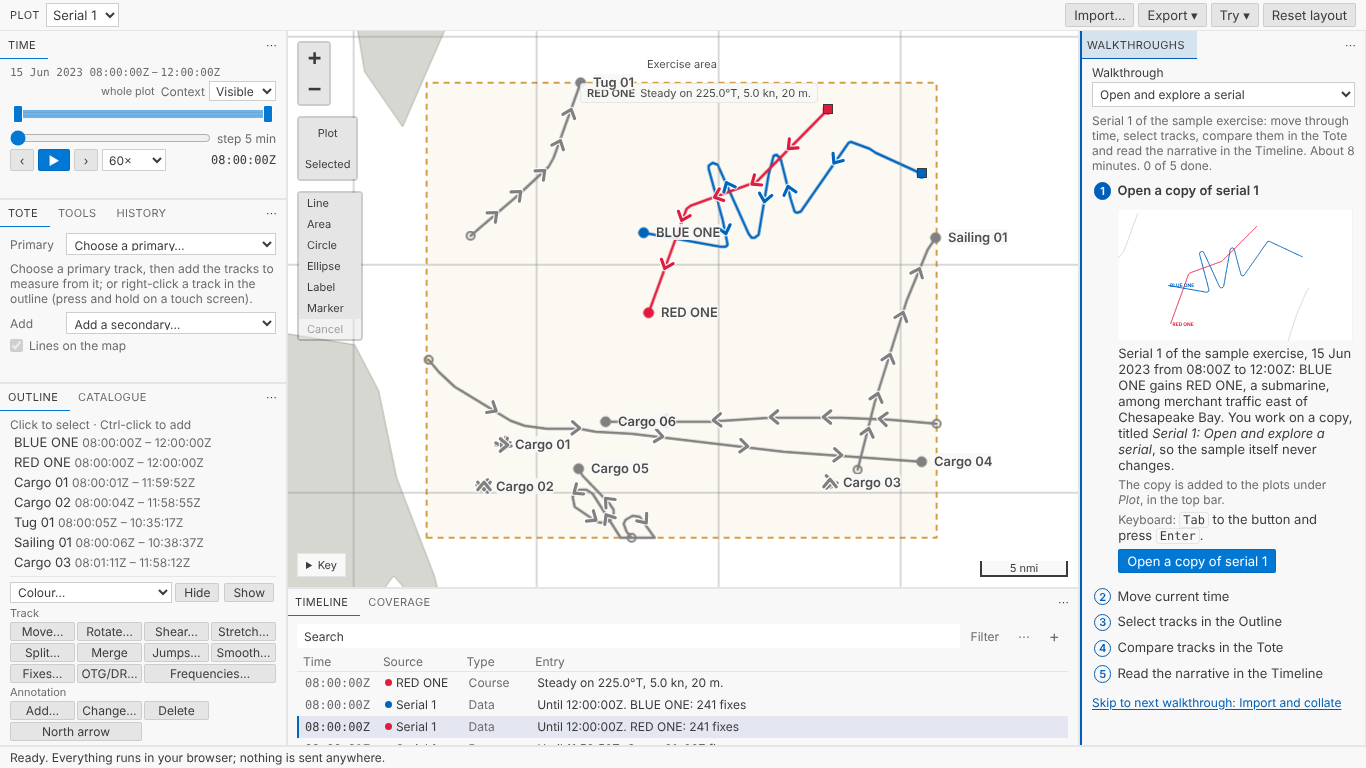
The same in the light theme. The tabs, borders and handles take their colours from the theme, like everything else in Debrief.
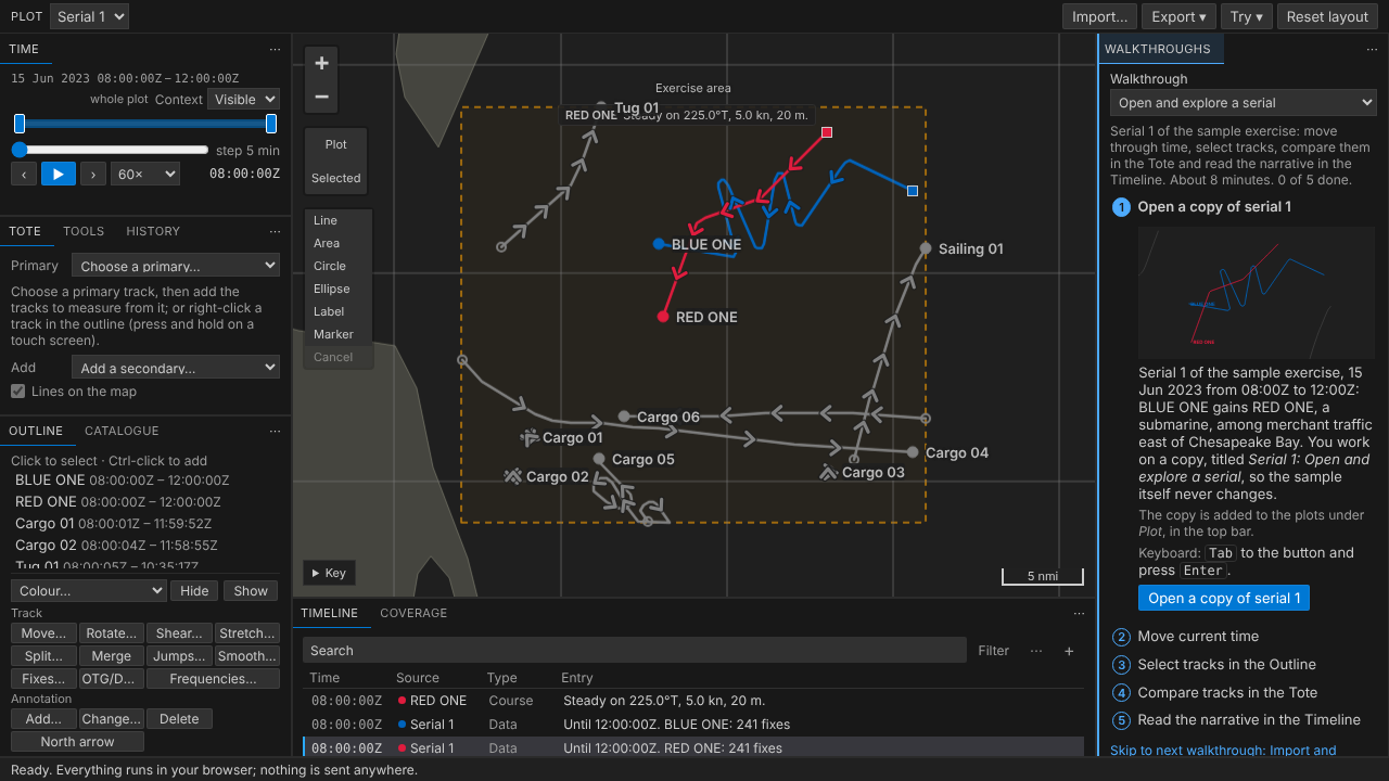
On a smaller laptop screen, 1280 by 720, the same layout, the map 740 by 519 pixels:
Fewer panels, and a top bar
Four panels were things used now and then, so they moved to a slim bar along the top: the Plot list, Import…, Export and Try, each a menu that opens under its button. Import… is in the Catalogue panel too, where new files arrive. Every control is where it was inside them, by the same name.
That leaves nine panels, grouped by task:
| Where | Panels | For |
|---|---|---|
| Left | Time; Tote, Tools and History; Outline and Catalogue | When, what is where, what is in the plot, and doing and what was done |
| Under the map | Timeline and Coverage | The narrative and the data, in time |
| Right | Walkthroughs | Learning, a step's words always in sight |
The Outline takes the rest of the column, so its list shows 7 of the sample's 11 rows on a 1366 by 768 laptop, with its track and annotation buttons in sight below it. While playing, the Tote is one tab away from Tools, and its lines still show on the map.
Make it yours
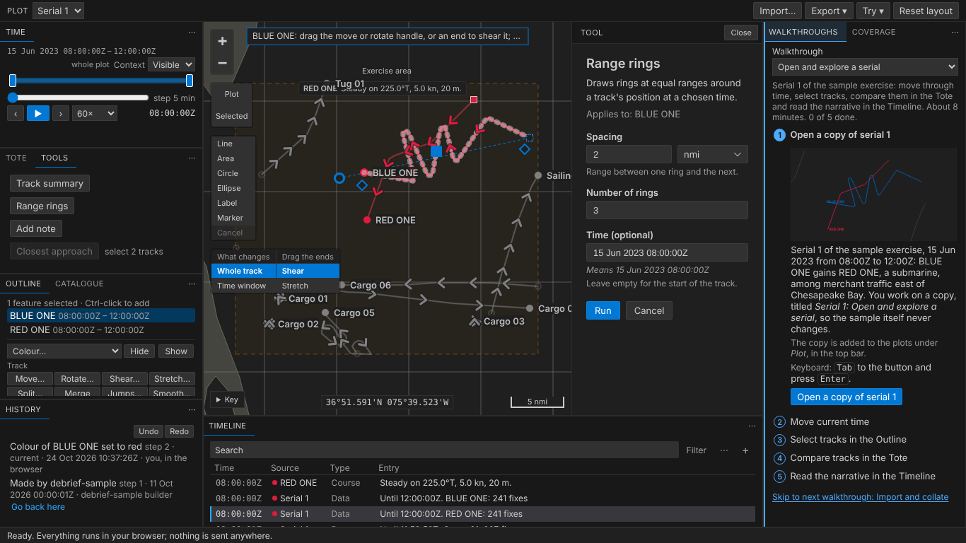
Drag a tab onto another group to join it, or onto a group's edge to split it. Here History has its own group under the Outline, and Coverage sits beside the walkthroughs, while a tool's form is open beside the map:
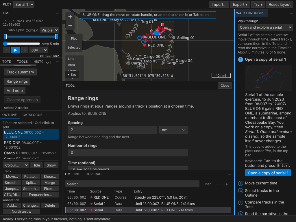
Where the map's place is narrower, as on a 1024 pixel screen, a tool's form goes under the map rather than squeezing it:
Your layout is kept in your browser, its shape only, never anything from a plot. Reset layout, in the top bar, puts it back as it started. Lists keep their place as you go, the Timeline at the entry you were reading.
Nothing reloads as you do it. The map, a tool's form and its results each run in a frame, and a frame moved in a web page starts again, losing what it showed. So they never move: the map stays where it is and the layout is drawn around it, and Python, running in the background, never notices.
Without a mouse
The keyboard goes through the layout group by group: Tab reaches a group's tab, then what its panel holds, then the next group; ← and → move along a group's tabs, Enter bringing one to the front. Shift+F10 on a tab, or the ⋯ at the end of each group, opens a menu to move the panel to another group (Move to left: Outline, Catalogue), or to a group of its own, or to reset the layout. Screen readers hear each group named by where it is and what it holds.
Tablets and phones
On a touch screen 900 pixels wide or more, as a tablet on its side, the layout is docked too, with bigger tabs and handles; the ⋯ at the end of each group moves its panel without dragging. Narrower, on a phone and in the blog's demos, the panels are one column as before, each folding away by its heading, with the top bar above.
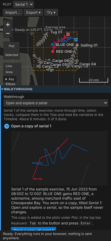
Drawing on the map, the note on how to draw is now one line at the top, and once you place a point it gives way to the distances and bearings.
The layout is built with Dockview, a small open-source docking library, in the browser only: VS Code arranges its own views. More in the guides: the browser layout and its keyboard equivalents.