Abstract
This posting discusses a modification that was made to make Debrief’s calculated data more accessible to scientific users. Whilst Debrief has lots of tools for data analysis, it remains possible to export this data to a spreadsheet for external analysis.
Customer
MWC
Backstory
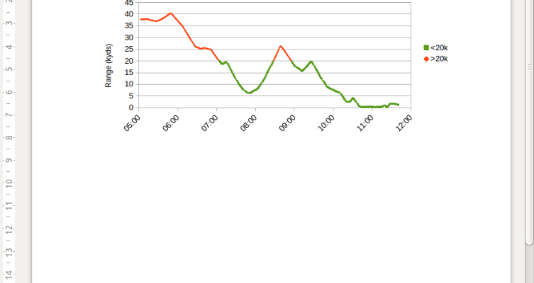
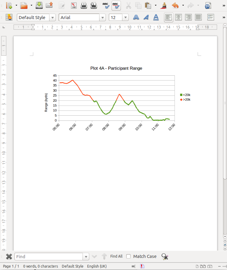
An analyst needed to product a custom XY chart to prove a hypothesis in an analysis report. In particular, he needed to clearly indicate time periods when the two trial vessels were within a particular range of each other. This level of customisability isn’t built into Debrief, a spreadsheet is the natural tool for the analyst to craft such a chart.
Problem
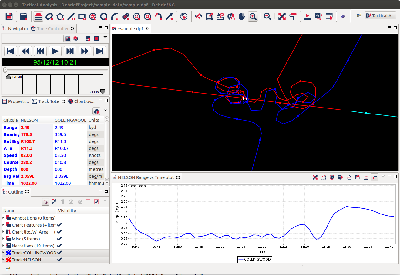
The analyst was able to produce a graph of range vs time for the two trial vessels using Debrief, but he had to get these figures out of Debrief in a form that could be transferred to a spreadsheet.
Once the data was in a spreadsheet the analyst would have complete freedom over formatting and manipulation of the data.
If it wasn’t possible to export this data from Debrief the analyst would have to go through a lengthy process of converting the raw data into a form suitable for a spreadsheet, then finding GIS algorithms suitable for calculating the ranges between two Earth points.
Process
The analyst contacted Ian, and asked if it was already possible to export the contents of Debrief XY plot for external analysis. They discussed what the analyst required of the data, and agreed the the data export facility would be of value across the full range of Debrief plots, not just the range time plot.
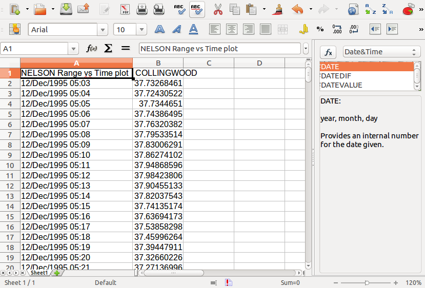
It was also agreed that the data should be pasted as text on the System Clipboard in Comma Separated Variable format, for optimal usage in MS Excel.
Solution
Ian’s team developed the new functionality, together with a new Export to Clipboard icon.
Once the updated software was delivered the analyst was able to export the calculated range data and import it into a blank spreadsheet.
Once in the spreadsheet he was able to use in-built formulae to separate the data into two separate series according to the calculated range. It was then simple to paste the two series into a Scatter plot, and apply formatting. This informative image was then used in the analysis report.
Long term
Debrief’s scientific user community have all earned their spurs in MS Excel, making it the go-to tool for quick numerical analysis and presentation tasks. The ability to let Debrief’s mature geospatial algorithms handle the number-crunching, then moving the data out of Debrief into a dedicated numerical analysis/presentation tool such as MS Excel has proven versatile, opening up the ways in which analysts can exploit the value of the data in Debrief.
However, when an external task happens more and more frequently it becomes more efficient to move the algorithms & processing into Debrief. This can be progressed using the Debrief support options.

Ian Mayo
Ian Mayo (from Deep Blue C Technologies) has been developing and maintaining Debrief since 1995, and helping users perform effective analysis and deliver persuasive results.