Last year's addition of Stacked Charts in Debrief started the movement towards more free-flowing analysis using Debrief. Stacked Charts allowed the analyst to consider the relationships between any kind of data in Debrief.
Traditionally Debrief had a tightly focused data model: platform tracks plus some sensor data. While new graphical annotations and cosmetic styling of tracks changed over the years, the underlying data (location, course, speed, time,etc) remained fixed.
Limpet is the Debrief sister application that allows the completely free-form analysis of measured data, and this new requirement has allowed the team to consider the role of the Limpet data structures, and to start to pull some Limpet features into Debrief.
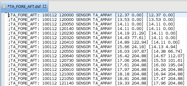
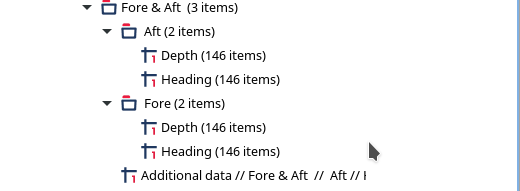
To support a new block of analysis, a set of users needed more diverse data to be analysed. It was still possible to represent this data in text format (via new REP file data types, see them here), but the data moved away from the traditional fixed set. Here is a sample (fictional) dataset. After the data type marker, date-time group, platform name, and sensor name, you can see pairs of depth and heading values. These represent the fore and aft sensors on a towed array.
To allow these diverse sets of data to be stored in Debrief, some elements (such as Sensor) are able to store additional data:
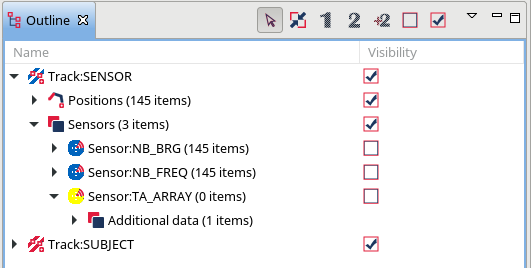
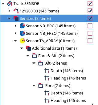
Once the above dataset is loaded, this data is present beneath the Additional Data:
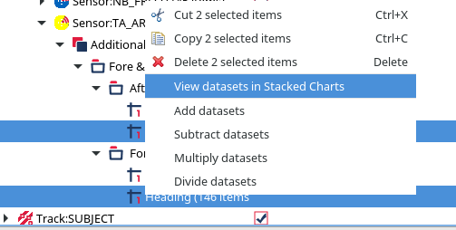
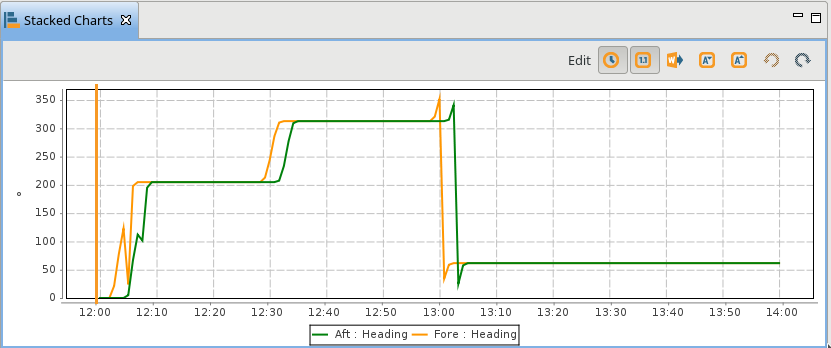
An elementary understanding of towed array performance indicates that the measurements from the array are most accurate when it's in a straight line. We can effectively judge this as the time when the fore and aft heading sensors are equal. The user can select the two headings, then right-click and select "View datasets in stacked Charts":
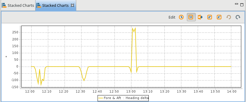
And here is the stacked chart:
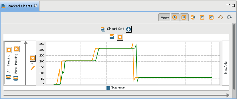
The curve of the array will lag behind ownship turns. To change the formatting, or add more data the user can switch the Stacked Chart to edit mode (see the Edit button in the above screenshot). Here's edit mode:
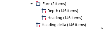
Once in edit mode, it's possible to add ownship course by dragging the relevant track from the Outline View and dropping it either on the existing left-hand axis, or adding it to right hand axis (note: since a track actually represents several datasets, a dialog invites the user to select one or more of Course, Speed and Depth). Once the course data is added, click on View to switch back to View mode:
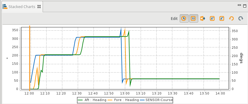
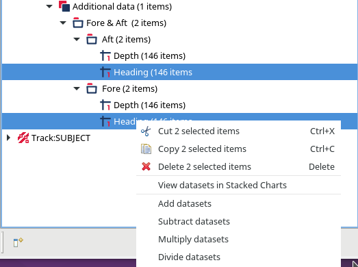
Let's talk through that plot. The blue line is the course. After each course change the fore module sensor changes heading, then the aft module sensor. The array is straight when fore and aft sensor values are equal. Thus, we can calculate these times by subtracting the value of one heading sensor from the other - when the difference is zero, they're on the same heading - and the array is straight. The new Limpet-style capabilities in Debrief allow this. Right-click on the two heading datasets, and the menu allows one to be subtracted from the other:
Once Subtract datasets is clicked, a new dataset appears in the outline view:
The automatically generated name (from the full name of each operand) is quite cumbersome, so it can be changed in the Properties Window to something more manageable:
Let's right-click on the calculated dataset and select View in stacked charts:
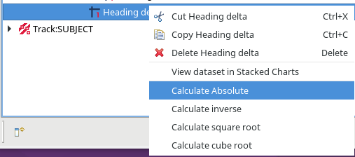
We can use the values in a dataset to shade a track. So, we could use a range of shades from blue to red to show the size of a value, with larger values being more red. We could apply such a shader to the above dataset, but it wouldn't highlight the periods when the value is zero. But, if we take the mathematical absolute value of each delta, zero will be the minimum. So, we right-click on the heading deltas, and select Calculate Absolute:
Here's the generated dataset:

We can also take the cube root of the data values, which will give a greater range of colours. Let's see the stacked chart with the absolute value and cube root:
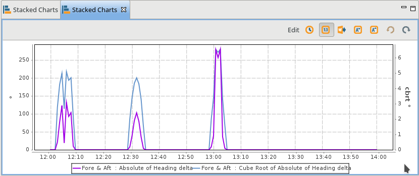
The actual values in use aren't relevant. But, the significant benefit of taking the cube root is that the "high" values are almost equally high. The purple absolute values cover a wider range, meaning the lower values will be closer to the shade used for zero.
Anyway, how do we get this data onto the chart?
A new Track property titled Track Coloring Mode lets us specify how the track should be colored. The current coloring mode is for track fixes to be shaded in their own color. This is called Per-fix shades. A new option allows for individual fix colors to be ignored, and just blindly use the track color: Track Color Override. More exciting than that, however, is the fact that Debrief can also show any suitable measured datasets within that track:
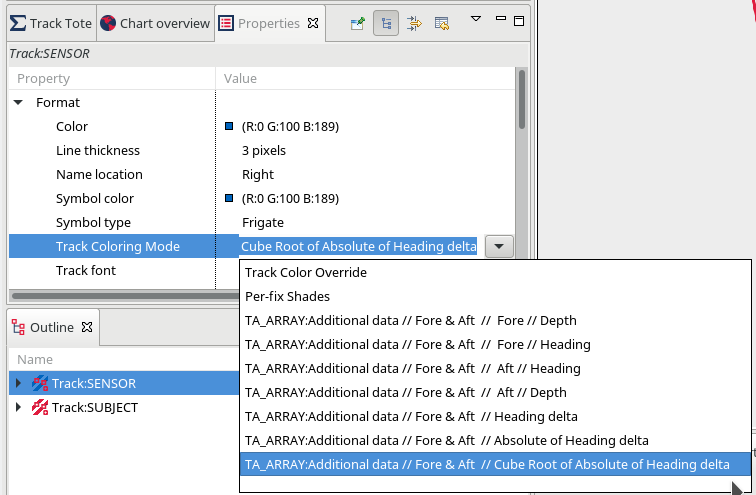 As you can see, our cube root of heading delta is included in the list.
Note:in the traditional way of supporting users in Debrief, the application would have a good look at those datasets, and only offer the one(s) most likely to be used. But, in the spirit of improving support for ad-hoc analysis, all datasets are displays.
Selecting to use the Cube Root of heading delta as the Track Coloring Mode renders the ownship track according to this value:
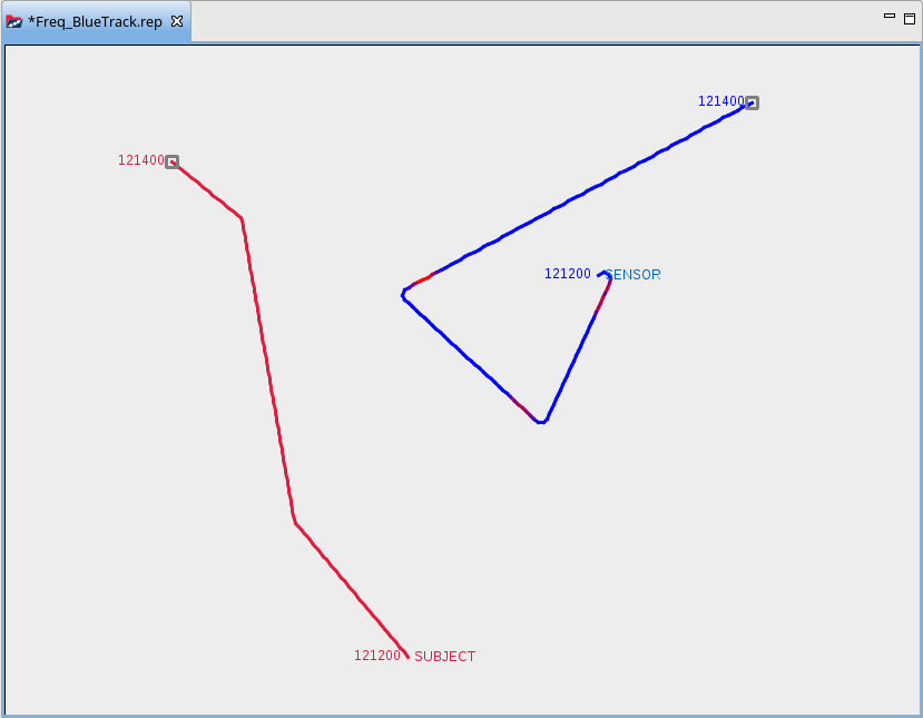
Here we can see that the heading unsteady periods are after the turns, and that the array effectively remains steady whilst ownship is conducting the turn.
Stay tuned as we add more ad-hoc data analysis capabilities to Debrief.

Ian Mayo
Ian Mayo (from Deep Blue C Technologies) has been developing and maintaining Debrief since 1995, and helping users perform effective analysis and deliver persuasive results.