For the last year we've been steadily progressing Debrief's data analysis capabilities (read last year's introduction here), adding features in packages focussed on analysts' requirements.
The first major realisation of this is in Debrief's new Tactical Overview display, which will be released later on today.
This posting will give you an overview of the capability.
Background
Analytical insight is frequently informed by context - understanding the background behind why events happen. When trying to understand why some particular outcome happened it's invaluable to have as broad as possible awareness of the underlying data.
For example, when analysing interactions, the point at which sensor contact is gained or lost is frequently the focus of analysis effort. A major part of this analysis is the investigation of why contact was gained or lost. In the acoustic domain this could be because of any of the following:
- Range
- Change in relative spatial geometry (either participant turning to expose a louder/quieter perspective)
- Change in speed
- Change in machinery status/lineup
A lot of this information is known to Debrief, but is present in different locations.
Solution
The Tactical Overview display in Debrief has been developed as a way of collating as much of this information as possible into a single, time-synced display. The Tactical Overview is a custom instance of the more generic Stacked Charts capability.
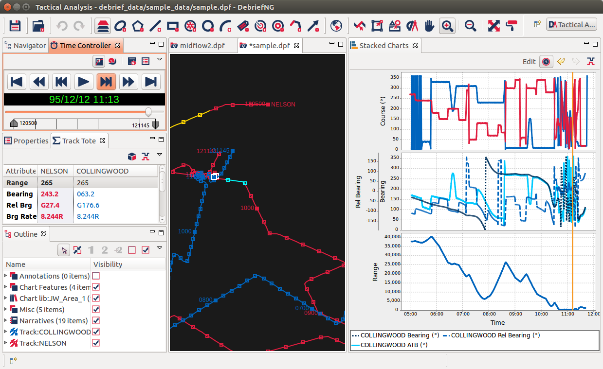
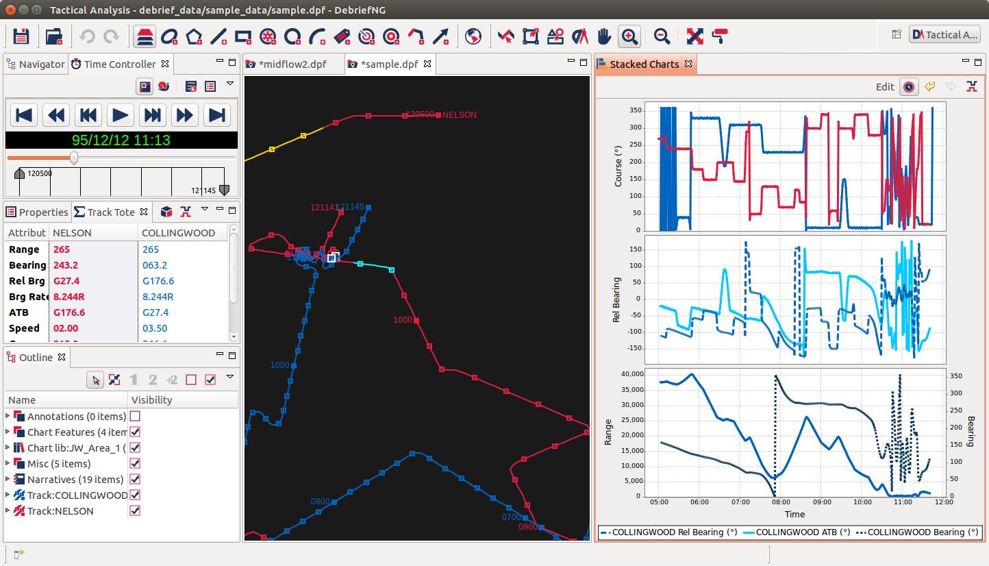
Shown on the right of the above screenshot, the Tactical Overview provides at-a-glance comparisons of vessel statuses and their relative relationship. The Orange marker line is shown at the current plot time, allowing the analyst to view all statuses/relationships at the current time.
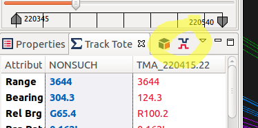
The view is opened in a single-click from the new Show Tactical Overview button in the Track Tote:
This then uses the current Primary and Secondary tracks to produce the plot shown below. As you can see, the top graph shows the vessel courses, the next one speed, then bearing/relative bearing/ ATB, and lastly the range between the vessels.
As the time slider is adjusted, an orange time now marker moves along the plot (much like the existing XY Plot views in Debrief).
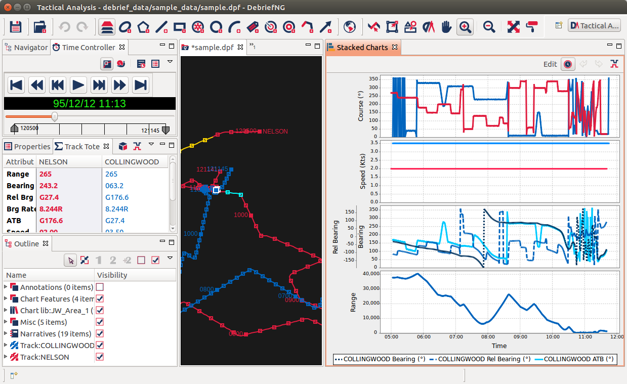
As you can see, in this case there Speed chart doesn't reveal very much - since the Speed data for this dataset is artificial. Let's remove it.
In addition to informing your analysis, these charts are a way of you presenting information/data/analysis. To allow analysts to focus on the data that is relevant, both for analysis & presentation, lots of effort has been invested in being able to easily edit these charts.
So, if we click on the Edit button, the chart will switch to edit mode:
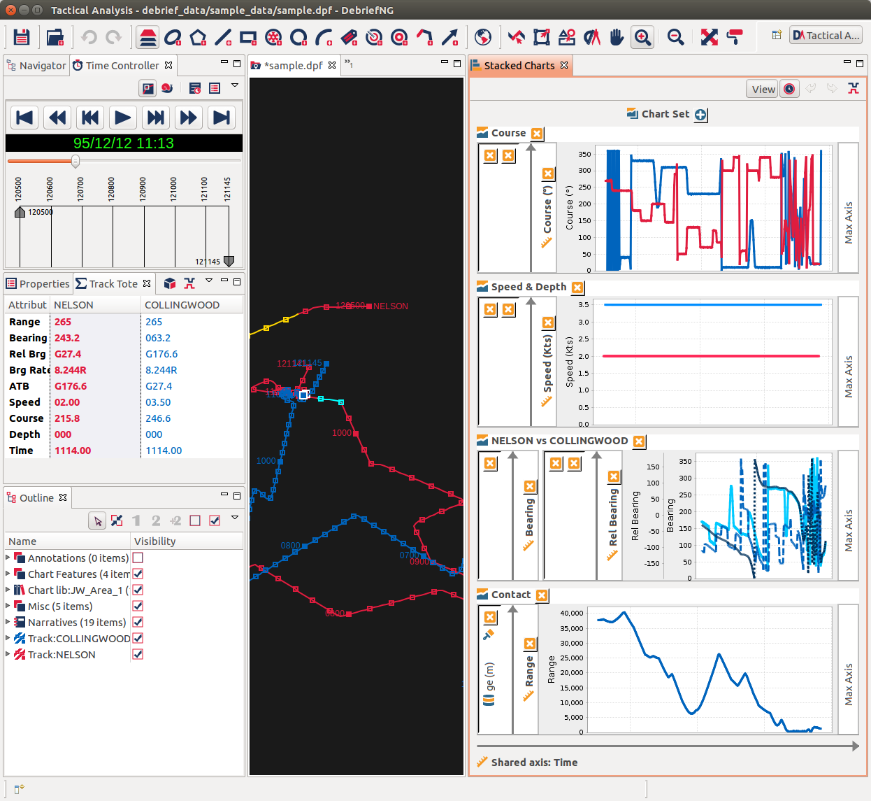
Here you can see the a breakdown of how the graphs are constructed. We're going to remove the second graph. To do this, just click on the orange "X" delete button next to Speed & Depth. The graph will disappear. Now click on View button to return to the view mode. This will give the first screenshot shown above.
Hold on, let's not skim over the glamorous rotation transition between the two modes. Here's another look:
Advanced usage
Let's make another change. Let's imagine that we wish to highlight some significant produce of the relationship between the ATB of the secondary track and the Range. Switch to Edit mode, and drag the Bearing axis on the middle graph to the bottom-right of the bottom graph - the landing pad titled Max Axis.
Ok, now switch back to the View mode:
We've now plotted ATB against Range in the bottom graph.
It's worth exploring the Edit view a little more. Here are some highlights:
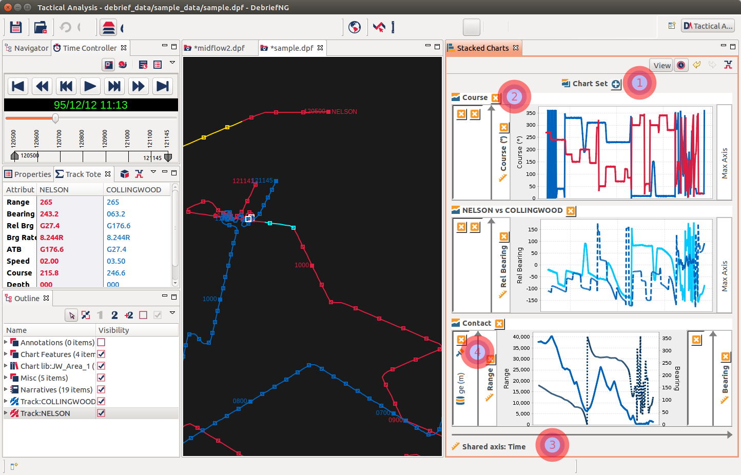
- click here and you can make high level edits to the set of charts. Currently this is covers the horizontal/vertical arrangement of the graphs
- click on Course to select the top chart, or on the X to delete the chart (as you did earlier)
- the charts all share a common time axis. Click here to edit the axis, including reversing the direction
- lastly, click on the paintbrush icon to make formatting changes
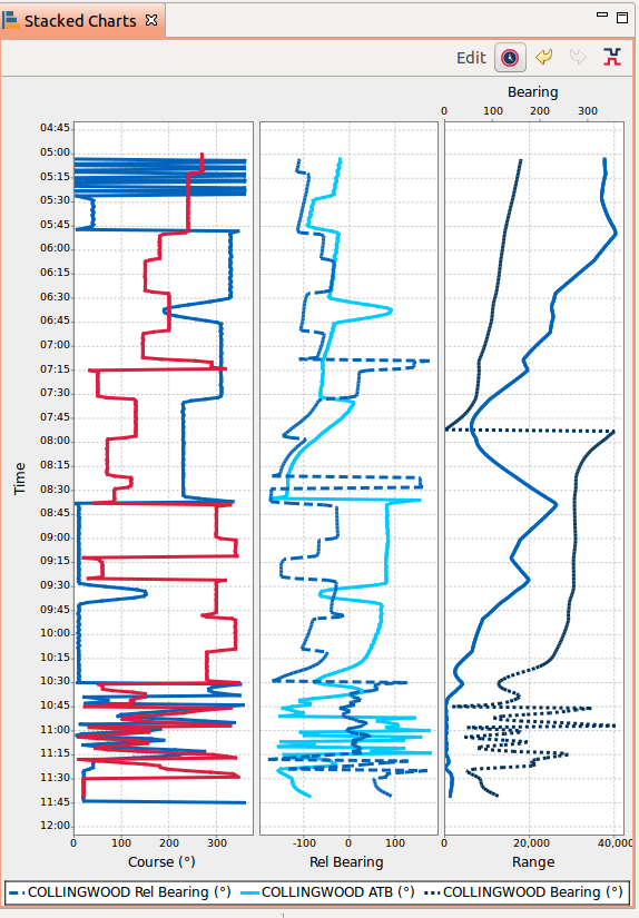
Note in the following screenshot how the graphs are stacked horizontally and the direction of the time axis has been reversed, to give a traditional waterfall display.
Another feature of the edit mode is how it is used to add more data. When in edit mode, if you drag a Debrief track from the Outline view onto either an existing Axis, or the Min Axis / Max Axis placeholder, a dialog will popup asking you which measurement to plot (course, speed, depth):
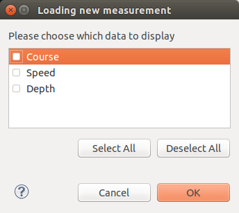
Tick the box(es) for the data you want, and it will be added to that axis.
What's next?
This is an early release, aimed at getting early analyst feedback.
We still have to implement persistence (so that effort invested in customising a set of stacked charts can be saved). There are also quite a few formatting/layout fixes in the Edit view, more work on how Debrief data is loaded into the view (to view something other than the pre-configured Tactical Overview).
As we add more Limpet-style data analysis capabilities in Debrief, users will be able to view/present more types of data in the stacked charts.
Any feedback on the Tactical Overview is most welcome, either direct to the Debrief project or via the GitHub issue repository using the guidance found in How to Create a Debrief issue.

Ian Mayo
Ian Mayo (from Deep Blue C Technologies) has been developing and maintaining Debrief since 1995, and helping users perform effective analysis and deliver persuasive results.