After 20 years of using the same colours, from 1st May 2015, Debrief gets a new color palette.
Following the introduction of an alternative background colour set (Debrief’s background was always black before), the decision was made to introduce a new palette set of new colours. This was not only to help with a cleaner look, but also to provide a better, crisp display of many of the on-screen features and components of Debrief.
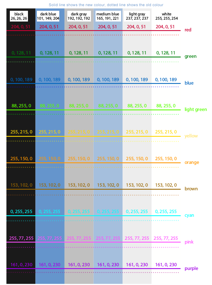
Designed by Julie Witmer, our exceptional and experienced GIS Cartographic Specialist, the colour palette shows that though the new Debrief colours aren’t quite as bright as the older ones, this has an improved effect when viewed against the newer backgrounds. The enhanced benefits of this are that it will make working with Debrief easier, and inflict less strain on your eyes (as shown below):
How This Helps You
How this translates to working within the program is better illustrated by the following examples.
In this example, you can see how the more subdued colours in the updated palette on the right aren’t as bright as those in the older version.
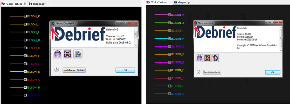
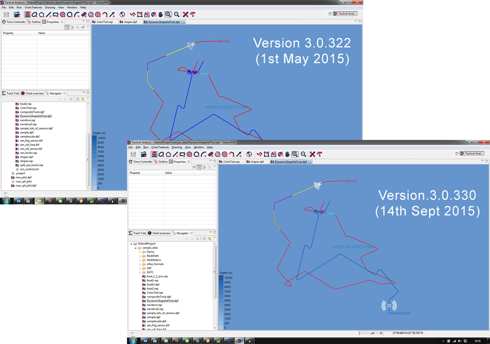
How this translates when working within the application itself is illustrated perfectly when we compare the shapes.dpf files:
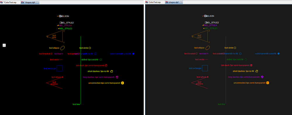
As you can see, the brighter and bolder colours in the older version (on the left), though eye-catching, can quickly become irritating and tiring on the eyes. Additional negative effects over time can be aversion of, and annoyance with, working with the programme. In contrast, by reducing the brightness, the lighter colours in the newer version - particularly the red, blue, and purple text against a black background - make reading on-screen text much easier all round.
When viewed against other background colours, such as the dark blue (101, 149, 204), these benefits can be further appreciated:
Admittedly these are subtle changes to the palette, but subsequent feedback has been encouraging, and we hope it makes working within Debrief easier for you also.
About the designer, Julie Witmer
Prior to becoming a GIS Cartographic Specialist, Julie worked as an archaeologist and as a problem-solver in IT for over 25 years. Now she combines her love of history and maps with modern-day technology to provide custom-designed maps to your exact requirements.
Click here to see her website: http://jewelcartografx.com.

Ian Mayo
Ian Mayo (from Deep Blue C Technologies) has been developing and maintaining Debrief since 1995, and helping users perform effective analysis and deliver persuasive results.